

Typography is a way to make an image out of words. Its like a style of art made from words. Its also a little like a style of writing. Its just that the arrangement of the words have to be in the form of the image. For example if I used an image of a person's face, the words would form the face. I think, typography images make a lasting impact because the words and color in the image just give you an idea. Typography images make a lasting impact because of the words used in the image.
 The biggest challenge when making the typography images was pretty much everything. I mean most things were kind of hard and some things were easy. The hardest so far was the teacher typography image. Right now when I'm writing this we aren't done with the typography image of ourselves, but there will be an image of it. But the teacher image was hard for me because some steps, I didn't understand very well. When I had to add the gradient I got a little confused but luckily I got help from Ashley and Kyla and I finished on time. My biggest challenge when doing the me images was probably trying to get like a white back round. Although I asked for help and I finished.
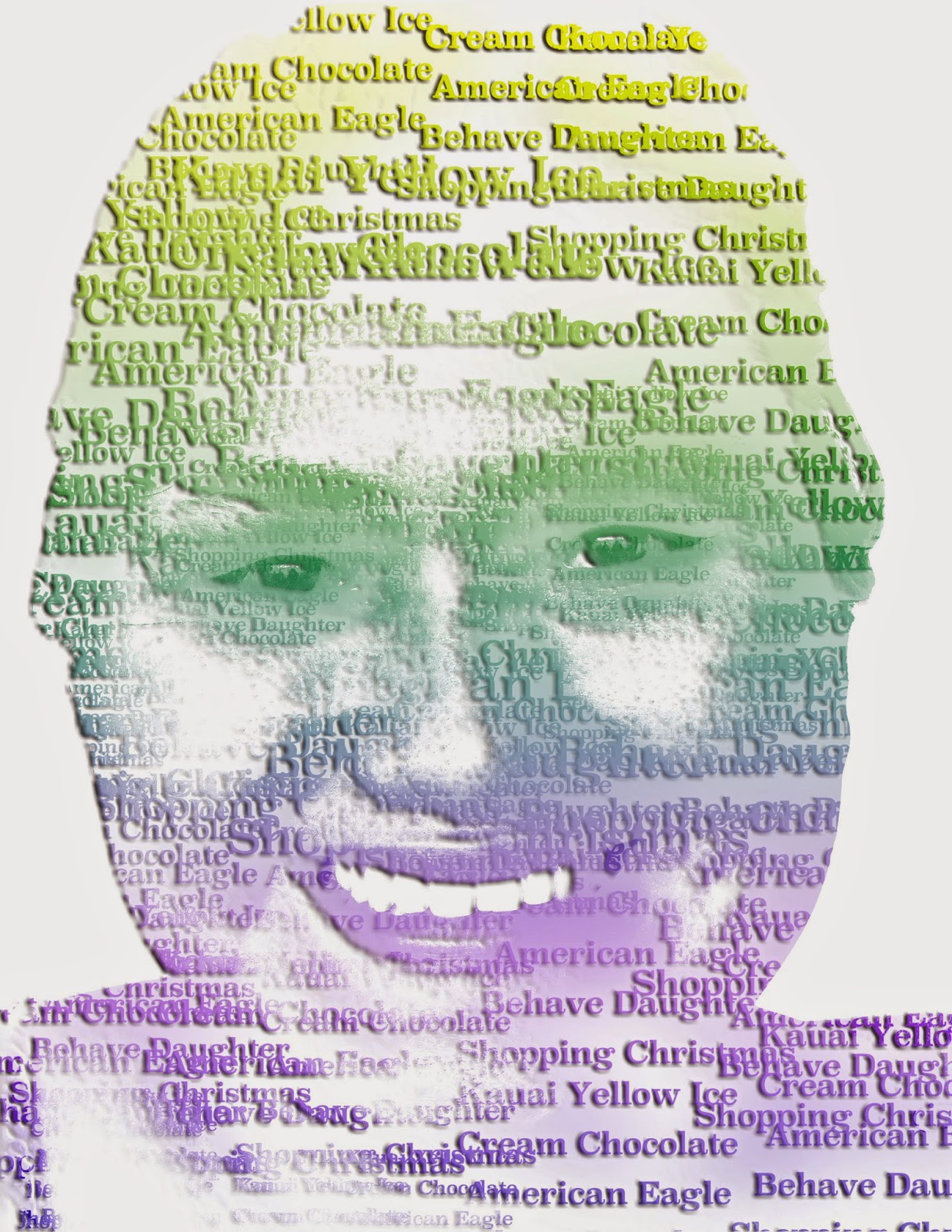
 From the three examples I think I like the teacher image the best. Although it was hard, I had fun making it. The first example shows an innovator. Her name is Marie Curie. We used words we found online. The second example is Mrs. Fujimoto, we used those words in her image because we asked her some questions about her self and those were her answers. The last example, is me. The words in the images of me describe me. The image was taken by Kyla. So far I have used the words, energetic, science, eleven, and reading. I chose reading because I like to read, I chose science because it is my favorite subject in school. I chose energetic because I am energetic. Im not energetic at school but I am at home. Lastly I chose eleven because I am eleven. The typography image of me was fun to make too. I think is was easier than the teacher image.
The biggest challenge when making the typography images was pretty much everything. I mean most things were kind of hard and some things were easy. The hardest so far was the teacher typography image. Right now when I'm writing this we aren't done with the typography image of ourselves, but there will be an image of it. But the teacher image was hard for me because some steps, I didn't understand very well. When I had to add the gradient I got a little confused but luckily I got help from Ashley and Kyla and I finished on time. My biggest challenge when doing the me images was probably trying to get like a white back round. Although I asked for help and I finished.
I really like how your word represent you
ReplyDeleteYou could have put a bevel to pop your words
And I really like the colors that you used
Great colors
ReplyDeleteThe Midtones make it look like something else
Great quality
I like the font you used for your text. It's very readable.
ReplyDeleteI think that the background colors doesn't really match with the overall color scheme.
I like the details that you used for you eyes.
Good colors
ReplyDeleteMaybe next time you should make it more like you
Nice font
I love the font.
ReplyDeleteGreat colors!
I can see the words very clearly
ReplyDeleteThere could be a little more detail in the picture
I like the color scheme you chose
I like how your words represent you!
ReplyDeleteI think you need your black and white image underneath.
I love your colors and how I can read your text
Great!
ReplyDeleteCould look more like you.
Good quality.
Good color.
ReplyDeleteMore words to fill in your face.
Good job overall.