Friday, March 13, 2015

Typography Images


Typography is a way to make an image out of words. Its like a style of art made from words. Its also a little like a style of writing. Its just that the arrangement of the words have to be in the form of the image. For example if I used an image of a person's face, the words would form the face. I think, typography images make a lasting impact because the words and color in the image just give you an idea. Typography images make a lasting impact because of the words used in the image.
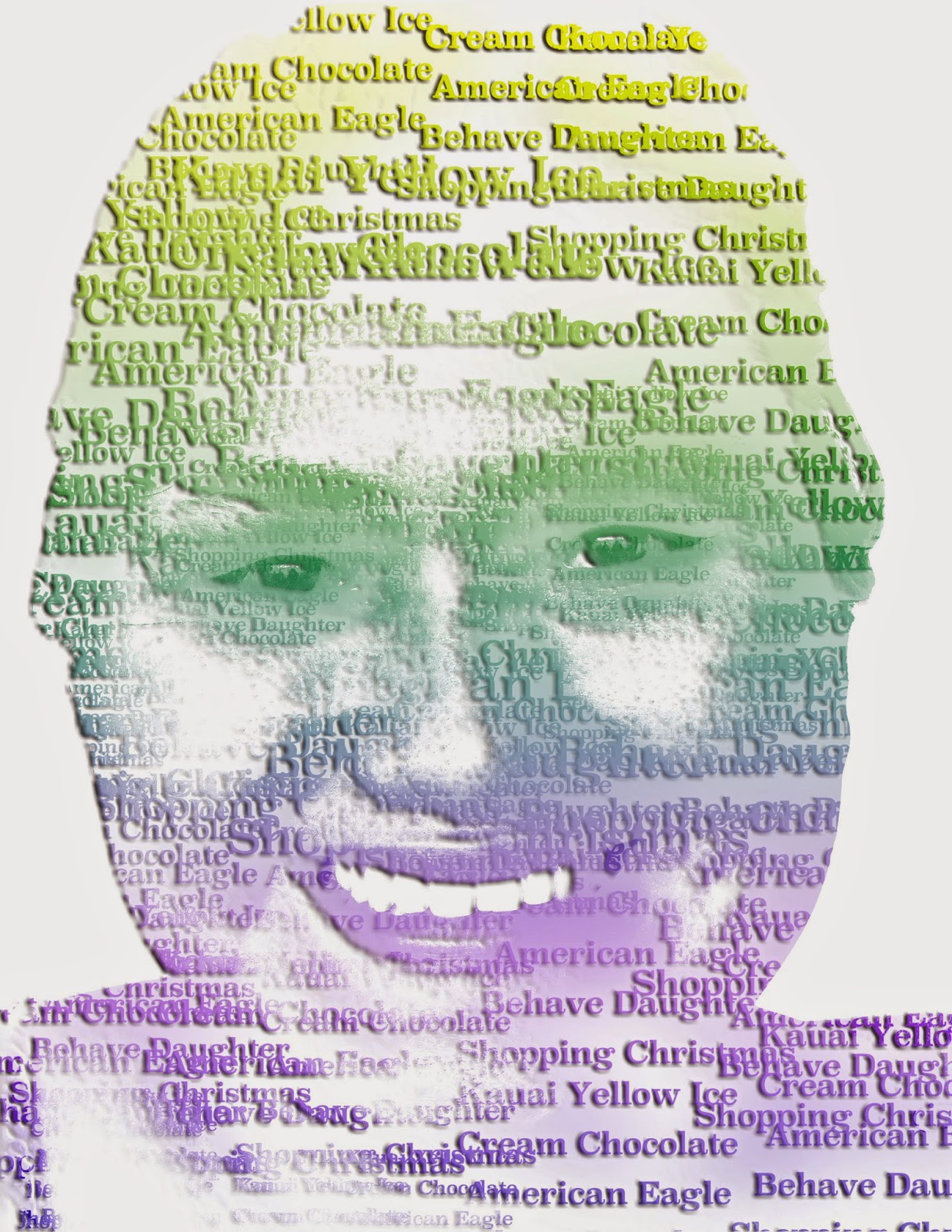
The biggest challenge when making the typography images was pretty much everything. I mean most things were kind of hard and some things were easy. The hardest so far was the teacher typography image. Right now when I'm writing this we aren't done with the typography image of ourselves, but there will be an image of it. But the teacher image was hard for me because some steps, I didn't understand very well. When I had to add the gradient I got a little confused but luckily I got help from Ashley and Kyla and I finished on time. My biggest challenge when doing the me images was probably trying to get like a white back round. Although I asked for help and I finished.

From the three examples I think I like the teacher image the best. Although it was hard, I had fun making it. The first example shows an innovator. Her name is Marie Curie. We used words we found online. The second example is Mrs. Fujimoto, we used those words in her image because we asked her some questions about her self and those were her answers. The last example, is me. The words in the images of  me describe me. The image was taken by Kyla. So far I have used the words, energetic, science, eleven, and reading. I chose reading because I like to read, I chose science because it is my favorite subject in school. I chose energetic because I am energetic. Im not energetic at school but I am at home. Lastly I chose eleven because I am eleven. The typography image of me was fun to make too. I think is was easier than the teacher image.


Monday, March 2, 2015

Double Exposed Portrait

Portrait photography is pictures of a person or a group of people to show their expression or feeling. But, in a portrait, it shows both sides of the face. In profile pictures, it only shows the right or left side of the face. The picture only shows the persons right or left eye and only one half of their face. Profiles are basically an outline of one side of their face. A silhouette is an image of a person, animal, object, or a scene. Silhouettes represents the shape and its single color. The color is usually black, but the edges matching the outline of the subject.

To create a double exposure in photoshop, there are a few steps. File>Scripts>Load Files in to Stack>Browse>Choose three images>Start. When you pick three photos, one needs to be a profile picture of a person and the other two has to be textures. For mine, I used a book page and tree leaves. Double exposure makes two images combine to symbolize a side of your face.


I used the book page because I like to read. I chose a book that I read last year called "Gathering Blue". When I read this book it reminds me of last year, which was a fun year. I used the tree leaves because I like nature. I love gardening and I have always loved gardening since I was little. I think my quality could improve because it looks a bit weird. My chin looks a bit weird because i used the dodge tool there when I didn't mean too.


Monday, February 9, 2015

HDR Photography


HDR photography is like drawing with light. HDR photography is used for taking pictures and you can take 3 or more pictures with different exposure levels. The thing i like about HDR photography is that we can create our own picture. Our own edited picture that we make our selfs. The thing I dislike about it is how long it takes to change the exposure. When you take pictures for an HDR picture, you try not to move the camera too much, or try not to move the subject. Although, when you take to long to change the exposure, you might move the camera a bit.

To create a HDR picture, it takes quiet a few steps. You'll need 7 pictures with different exposure levels. When you have that, you'll need to use Photoshop. Then go to File>Automate>Merge To HDR Pro>Browse, then choose your 7 photos to use. Then play with the effects 'till you get what you want. This is just a guess but, I think HDR is different then automatic HDR functions because you get to take the pictures your self.

When we started with our HDR pictures, my first thought was, it has to be surrealistic and it has to meet the expectations. So when I started with my experiment I tried to make it look surrealistic. Although I could see a lot of ghosts in the picture, I tried to work with it. I played with the settings and I got what I got. I worked hard on this project.


Friday, January 23, 2015

Movie Trailer Critique


Our movie trailer is about a guinea pig named George. This guinea pig goes on an amazing adventure. My teammates in this project are Lani, Sophia, and Shaday. We are team 3. George is Shaday's guinea pig so without her, our trailer would turn out totally different from what we have now. In the beginning, we were thinking about making the movie like "UP". We were going to make it look like George goes into a balloon basket and fly away on an adventure. But we didn't include that. I tried to help as much as I could. Shaday did do most of the editing, and we always met up at her house. I think Shaday contributed the most. I tried to go to her house and help out as much as I could. I think I didn't go only once or twice. But I helped with filming as much as I could.

The requirements for this project are, the trailer has to be at least one minute and thirty seconds long and the longest it could be was two minutes and thirty seconds. Another requirement was that you need the movie trailer poster somewhere in the trailer. We also needed 5 scenes, a voice actor and dialogue.  The other requirements were you need transitions, Foley, and text layovers. We added music as well, I think everyone did. Our team completed all the requirements. We had the poster, it was a minute and thirty seconds, and it had transitions, text layovers, a voice actor etc.

Our movie trailer got four out of four. Ten people voted our trailer as the best. We got the most votes. I think we did good. I agree with the results. I think we got a good grade and we deserved it because we tried our best to complete this project. From this project, I have learned, that guinea pigs are hard to work with and I have also learned some new words. For example, Foley. In the results, for the requirements we got two people who thought we could use improvement. I think we could have used improvement too but overall, I'm happy with our grade.


Monday, January 12, 2015

Movie Poster Promo

In this project me and my team are making a movie trailer. Our team is me,  Shaday, Sophia, and Lani.  In our movie trailer, a guinea pig named George is on an amazing adventure and runs into several problems. George is a wild guinea pig who gets captured. Our poster includes Shaday's guinea pig, George, who is the main character.

Our movie trailer title is Snoopy George. We chose this title because our movie trailer is about a guinea pig named George that goes on an adventure because he is tired of his old life. We have included the names of our teammates, Lani Alo, Sophia Gregory, Shaday Thomas, and me, Denae Sacramed. We also have included the name of our main character, George. Another thing it has are reviews.

The drop shadows on the text make the title more noticeable because without it its kind of hard to see. The layer effects help make everything pop out and easier to see. The effects and layers made the poster more interesting than just letters and a picture. The effects on the text make the words pop out. The effects I used on the text were drop shadow, stroke, and bevel and emboss.


Monday, December 1, 2014

Proactive or Procrastination?

I am try my best to be proactive but most of the time, I will procrastinate. Sometimes when I have no idea what to do I procrastinate but most of the times I will ask for help or try to solve it alone. I am proactive some times because I try to finish my work and I try to make it my best work. I will try not to procrastinate although I do. I have been proactive on most of my big school projects but some, I have procrastinated. The current school project that we are working on, I will try my best to be proactive and not procrastinate.

I always try to be proactive and I am most of the time. When I am productive, which is most of the time, I have a lot of free time which makes me bored, it kind of makes me wish there was more work to do, but, Im happy that there isn't a lot at the same time. It always pays off when you are proactive. Sometimes I am a procrastinator so I dont have a lot of free time. Although when I am proactive, I am really bored.

What I would change about my habits, I guess I would change the fact that I always end up doing most of the work at the last minute. Only on some of my projects have I waited 'till the last minute to finish up. But theres only a little amount of work to do, when its last minute. I honestly think I am a procrastinator but i have always tried my best to be proactive. I have and will always try my best on all my work.


Thursday, November 13, 2014

My Visual Poem

< />

 My visual poem is about dogs. I chose dogs because dogs are loyal and each are special. Each one is different weather its on the outside or inside. They may look the same but their behavior is different. Dogs are an animal that are different than any other. Each animal is different and I chose dogs because of the loyalty they show to their owners. A bond between an owner and is special.

When editing, I used the kens burns effect to zoom in on a picture. This effect affected it by showing how a dog is listening to its owner. The other effects i used didn't affect my visual poem as much as I wanted it to do. I didn't use that many effects because I didn't have enough time too get it all done but at least I finished. Im happy I finished on time. It could be better but thats okay.

I think my visual poem could have turned out better. I could have used more effects and I could have gotten more b-roll. I don't have a video in it either so I think I could have gotten a video. I tried to get video but that didn't work out very well. But thats okay. I finished and at least I tried. I think the the results I got are fine.